Google Analytics is a powerful tool that tracks and analyzes website traffic for informed marketing decisions.
Service URL: policies.google.com (opens in a new window)
_gac_
Contains information related to marketing campaigns of the user. These are shared with Google AdWords / Google Ads when the Google Ads and Google Analytics accounts are linked together.
90 days
__utma
ID used to identify users and sessions
2 years after last activity
__utmt
Used to monitor number of Google Analytics server requests
10 minutes
__utmb
Used to distinguish new sessions and visits. This cookie is set when the GA.js javascript library is loaded and there is no existing __utmb cookie. The cookie is updated every time data is sent to the Google Analytics server.
30 minutes after last activity
__utmc
Used only with old Urchin versions of Google Analytics and not with GA.js. Was used to distinguish between new sessions and visits at the end of a session.
End of session (browser)
__utmz
Contains information about the traffic source or campaign that directed user to the website. The cookie is set when the GA.js javascript is loaded and updated when data is sent to the Google Anaytics server
6 months after last activity
__utmv
Contains custom information set by the web developer via the _setCustomVar method in Google Analytics. This cookie is updated every time new data is sent to the Google Analytics server.
2 years after last activity
__utmx
Used to determine whether a user is included in an A / B or Multivariate test.
18 months
_ga
ID used to identify users
2 years
_gali
Used by Google Analytics to determine which links on a page are being clicked
30 seconds
_ga_
ID used to identify users
2 years
_gid
ID used to identify users for 24 hours after last activity
24 hours
_gat
Used to monitor number of Google Analytics server requests when using Google Tag Manager
1 minute
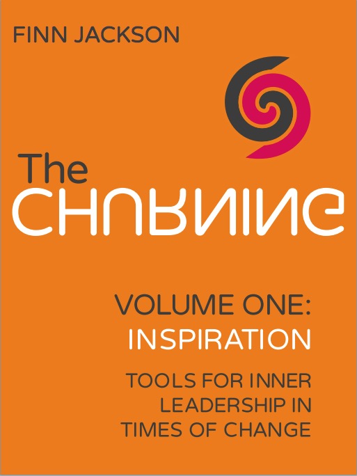

Finn, I think the most readable is the one without the reversals or mirroring of letters. The others seem too convoluted. The cover needs to work quickly, and they take a bit too long to register. Arguably, you could simply reverse the “R” in the word, but that starts to look like Toys R Us…
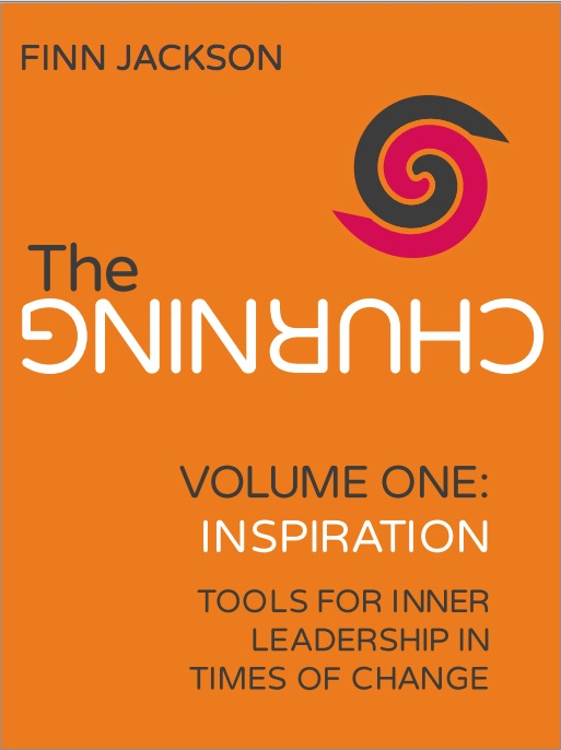
agree to this view. probably u can turn the G around towards the C.
Thanks Chris. A nice idea.
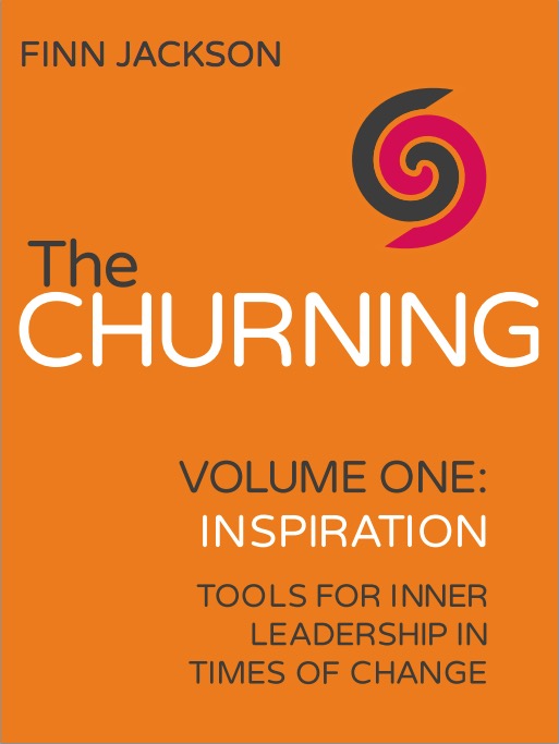
Thanks Chris, and for the suggestion of “Churning R Us”.
I think the letter reversal is a good idea as helps to promote the concept, except versions 1&2 are too heavy – you need to know what it’s saying in order to “get it”. I would suggest to mirror the second “N” – it would remain fully readable, but there would be a sense of something not quite right – a minor conceit if you will. The appropriate demographic for this kind of publication would see it on the 2nd or 3rd glance and be both amused and intrigued.
A nice idea Andrew, thank you. We’ll try it out.
Version 3, normal wording. You have three seconds max to grab someone’s attention and if they think the book is upside down or in another language, they won’t stop, the other ones make me feel a bit seasick, and the word churning exacerbates this!
Personally dislike orange but I accept its eyecatching. Maybe a little less intense, or graduated?
Good luck. X
Thanks Sally. That certainly seems to be the consensus. 🙂